


Hi there, welcome again.
This week you will be reading about deceptive patterns in UX, why it is used and how to avoid the use of deceptive patterns as a designer.
But first, if you are not following this blog, please do so and also check out my previous blog posts linked below. I promise it won't be a waste of your time.
UX Categories, Career paths in UX, The Gestalt Principles
Now let's get right into it.
Deceptive patterns often called “dark patterns” involves using some methods to trick users into doing or buying or even participating in something that they wouldn't otherwise have done or participated in.
Deceptive patterns was introduced in 2010 by Harry Brignull who is an ethical UX designer alongside the world wide web organization.
Considering other points like business needs, we might tend not to see anything wrong with using deceptive patterns to get people to buy products or subscribe for certain services. But regardless, it is important to note that there are other safe and non-deceptive techniques that can be used to get users to buy your products or services without deceiving them.
Let's quickly explore some common deceptive patterns in UX
FORCED CONTINUITY
This involves forcing a user to subscribe or continue with his/her subscription with your product or service after a free trial and billing these users without their proper consent. For instance ;
Mr. A wants to sign up for the free trial of a particular product which lasts for a month. Mr. A shouldn’t be asked for his credit card details as a prerequisite for this sign up. Instead he can just be locked out of this product once his free trial expires and then be asked to pay to continue using this product. Even if his credit card details are on the product’s site, he shouldn't be billed without his proper consent.
This doesn’t provide a good UX.
SNEAK - INTO - BASKET
Have you ever tried using an e-commerce website or a flight booking website and somehow some products or bills get added to your checkout list that you have to pay for by default? This method of extortion is called sneak-into-basket. Sadly, many software products lose their customers(users) as a result of this.
URGENCY
This involves making a user sign up for or use a product sooner than they originally want to by making them feel like they will miss out on something huge or an amazing deal if they don't. This is okay if it's true but most of the time, it's not. Its only a deceptive pattern that is being used to get users to pay for products sooner than they want to. Ever gotten a pop up like this?
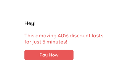
This is a typical example of urgency as a deceptive pattern.
SCARCITY PATTERN
This involves making a user sign up for a product/service sooner than they will like to by making them feel like that will be their only chance to use that exact product or service. Ever tried booking for a flight and then you see something like this ;

Or something like this while buying a product online ;
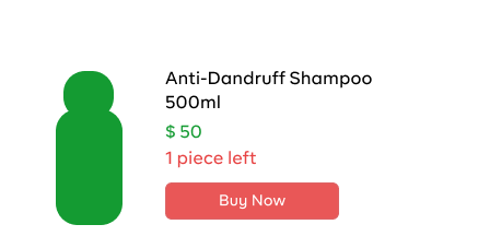
If you've ever clicked on the buy now or book now button just like me, then congratulations! You’ve also been a victim of deceptive patterns in UX.
WHY ARE DECEPTIVE PATTERNS USED?
Money. That's the simple answer to this question. The use of deceptive patterns is an easy way to earn more money from a product or service.
Let's quickly talk about this;
HOW TO AVOID THE USE OF DECEPTIVE PATTERNS AS A DESIGNER
It is important for designers to avoid the use of deceptive patterns while designing a product. These deceptive mechanisms don't provide the best experiences for users. There are other techniques that can be used to get users to use or pay for your products without deceiving them. Keep the following points in mind before designing a product;
Figure out ways to be as transparent as you need to be. The use of deceptive techniques is not relevant in any way. If your product will be beneficial to the user, then they will subscribe to it. Show exactly what the product is or the exact service being rendered. If there are offers attached, make sure they are as detailed as possible.
Do your proper research before putting your products out there and determine your target market.
- Ask for the user's consent before using their personal details even if its to their advantage.
- Use easily understandable and simple language to provide information rather than using fancy words to cover facts.
- Color combinations should provide clarity as to what the product stands for.
- Use designs and content that makes sense and clearly states what the users should expect.
These are just a few tips to put in mind while in the ideation stage of creating a product or even in the design stage. They help to provide the users with an amazing experience, one that deceptive patterns wont give them.
Please let me know your thoughts on deceptive patterns in the comment section. Also, please like and share this article and also don't forget to follow this blog so you can get notified once there is a new post.
Connect with me on Twitter, Instagram, Linkedin and Github.
I hope you found this article helpful.
Until my next post, bye for now.