


Table of contents


No headings in the article.
Hi there,
I hope you are having a great week and I hope you have seen my two articles from last week. If you haven't seen them yet, you can click on the links below to read them.
UX Categories, Career paths in UX
This week, we’ll be talking about the gestalt principle.
Ever wondered how the human mind is able to recognise patterns in products' interfaces or similar elements, such as the way the content of a website is structured?
This is as a result of the gestalt principles. Designers follow the gestalt principles in order to help them organise contents on their design. This makes the design aesthetically pleasing and also very easy to understand.
The gestalt principle was first created by German psychologists Max Wertheimer, Kurf Koff and Wolfgang Kohler. Their primary reason for this study was to understand how humans gain meaningful perceptions from chaotic stimuli around them.
Overtime, designers and other professionals began to adopt the gestalt principles. The gestalt principles are very essential when it comes to visual design, and abiding by them will help give your users an amazing UX(user experience).
You can read this article to find out who the visual designers are. Career paths in UX
Now that we have a proper background knowledge, it's time for us to dive into these principles.
Similarity
The principle of similarity states that when things appear to be similar to each other, we group them together. We also tend to think that they have the same function. An example of this principle can be seen in the identical colour format of links in software products. You will agree with me that some software products use blue-coloured text with an underline beneath the text to indicate clickable links. The most common way of representing links is the use of an underline beneath the text. This makes it easier for users to differentiate the clickable links from other text. An example can be seen in this article. All the links are underlined.
Proximity
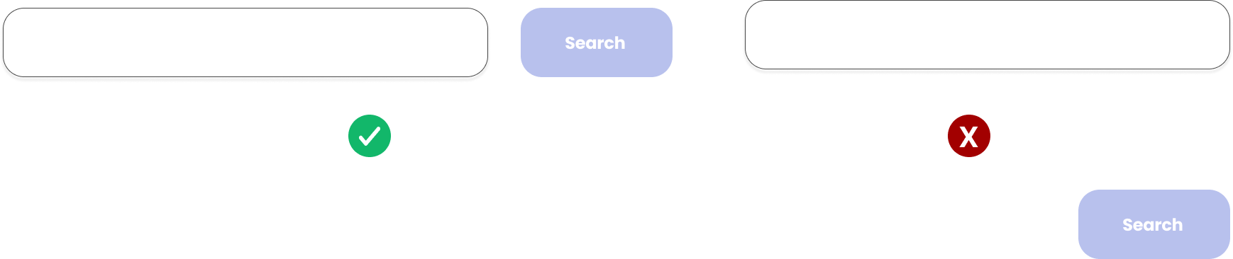
The principle of proximity states that elements that are close to each other appear to be more related than things that are spaced apart. An example of this can be seen in the use of search buttons close to the search text-box. Failure to have this button close to the text-box will not provide the users with the best experience while using that software product.
Common Region
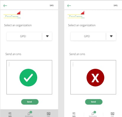
This principle states that elements located within the same close area are perceived to be grouped together. Have you ever noticed that the navigation bars at the top or bottom of a mobile phone screen are usually a different colour and are grouped with a border? This can be seen as a perfect example of the common region principle. Having these icons float on the screen without a background border might not provide the best UX. Using a border beneath the icons helps the users to recognize that the icons in the navigation bar are important, and it helps the icons stand out, which in turn provides a good UX.
There are several real design examples that follow these three gestalt principles. If you can figure out any, please share it with everyone in the comment section.
Connect with me on Twitter, Instagram, Linkedin and Github.
I hope you found this article helpful.
Until my next post, bye for now.